Formulating Startup Brand Guidelines
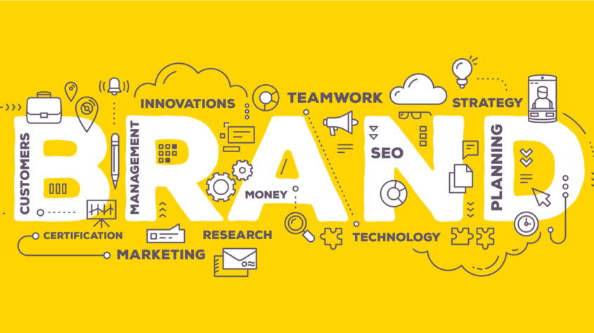

“Your brand is what other people say about you when you are not in the room”
— Jeff Bezos
A Brand Guideline is a formal document that defines who you are, what you propose to do, your story, colours that you can be identified with, your logo – basically in various ways it defines your business and establishes an identity for your business.
Whether it is your product or your website or your marketing promotions, there has to be consistency across the various depictions of your brand.
It is important to understand first why you need to define Brand Guidelines formally.
Generally the Brand Guideline document is created for sharing with any advertising agencies that you may work with or for that matter for your own in-house marketing team, for press releases etc.
More than that, it is the consistency that it depicts for your business.
Let’s look at this way.
Say there is someone you know who is always prim and proper. Out of the blue one day he walks in with a shabby look. It is going to cause an element of surprise and discomfort when you look at him. 🙂 . In the same way, your brand needs to maintain consistency. If you decide that your brand’s social media voice will be semi-formal always, you can’t just host a comedy show out of the blue and break the consistency because people would not relate to your brand then.
There are six given components of a Brand Guideline document. It is not mandatory to define all. Although it is recommended that you do.
- Brand Story
- Colour Palette
- Typography
- Imagery
- Voice
- Logo
Brand Story
Who knew that you would find yourself dazed when someone told you – What’s your Startup story? And that too out of the blue!
Something that you have been nurturing in your heart and soul for so long now.. But when someone asked you to elaborate on it, you found yourself tongue tied. Not to worry. Happens to all of us.
Happened to me when I was in front of an investor, all set and ready for a Pitch Meeting. I was all prepared with the most tedious and mind boggling questions like technology used, Artificial Intelligence, Automated Marketing for Lead Generation and blah blah blah.
And then, when all he said was – “Anu, tell me your story”, I went pale. All I said was a bunch of words filled in with a lot of “You know.. You know..” which meant I was buying time to think what to say!
After that lesson well learnt, next time I went prepared more from the heart, than from the mind and here are a few points from my learning..
1. Focus on the Customer’s Pain Point
It all begins with a Problem.
A genuine problem someone faced which you decided you would solve for them. It could be close to home, in your personal network. It could be something you saw on the road. The trigger could be anything. Anything, that needed solving – and you jumped in like a Knight in Shining Armour to resolve it.
Leah Neaderthal saw friends struggling with Sales. That inspired her to start her business Growthworks Solutions
Peter Boyd, a lawyer, began PaperStreet Web Design, because he could not take the fact that Law Firms had awful websites.
Daisy Jing of Banish had an acne problem! She decided she would help people by addressing them on YouTube. It was these people that inspired her to create her own line of products.
Think about what was the story behind the problem that inspired you to start up and pen it down with all your heart and soul. Put yourself in the shoes of the person facing the problem and describe it with the same pain that they would have felt dealing with it.
2. Propose how you plan to solve the Customer’s Pain Point
Solutions and advice are plenty and freely available when a problem is presented.
The idea is to have a clear action plan after deep assessment of the problem at hand. Not just an action plan but an action plan with timelines and milestones. That is a real solution!
It gives the person facing the problem a hope of a tangible solution. Without that your solution story is incomplete. Evaluate and brainstorm from all aspects to cover any loop holes that may creep up.
Think and propose as to how you plan to reach out to others who are facing the similar problem. You need to have a clear strategy as to how you are going to shout out from the rooftops to all the relevant people that you have a solution to their problem.
Yes, I am talking about How you plan to market your product.
Colour Palette
This one is interesting! Wish I knew it when I chose my brand colours. This is embarrassing but I have to admit I selected my brand colours – grey and orange, because I really liked the combination
[Embarrassment emoji]Now I know there is a complete theory behind colour psychology. Here goes.. Some explanations related to colours and some brand examples for each.
Red
Red colour triggers powerful positive and negative emotions, urgency, adrenalin – sets the pulse racing.
Image ref : Hubspot
Orange
Generates a feeling of warmth – bright, light and fun
Image ref : Hubspot
Yellow
Yellow represents sunshine, youthfulness, brightness (like orange)
Image ref : Hubspot
Green
Green is synonymous with agriculture, health, environment.
Image ref : Hubspot
Blue
Blue represents cool, calm, strength , wisdom and is generally categorised as a corporate colour.
Image ref : Hubspot
Purple
Purple is related to superiority or royalty and prestige. Also has a feminine touch to it due to is closeness to pink.
Image ref : Hubspot
Magenta
Magenta, being dark pink is closely related to femininity and often youthfulness.
Image ref : Hubspot
Black
Black donotes luxury and power. Interestingly most unicorns have black, white or grey as their brand colours.
Image ref : Hubspot
White
White clearly represents clean and neat.
Image ref : Hubspot
Typography
Typography is the selection of fonts to be used across your logo, website, product and marketing promotions.
I am not saying you have to use only those all across mandatorily, but it is recommended to maintain the consistency of the brand.
Here is a helpful guide based on what you brand is supposed to project :
Here are the personality traits of the 6 top font categories:
- Serif fonts are classic, traditional, and trustworthy
- Sans-serif fonts are modern, clean, and help create minimal designs
- Slab serif fonts are bold, quirky, and confident
- Script fonts are elegant and unique
- Handwritten fonts are informal and artistic
- Decorative fonts are stylized, distinctive, and dramatic
Imagery
Of course you will use different images as the need demands – be it the website, product images or marketing promotions. But defining the basic imagery for your brand helps to ensure you are not going off track or conveying a wrong message.
Generally what is recommended is a Mood Board.
Mood board: Collect images that convey the feeling that you want people to get when they interact with your brand.
Voice
Brand voice is the tone of your brand. It strongly affects how your audience feels about you.
Use the following tips to define what is your brand voice.
- Build on personality: Remember that list of 3-5 adjectives that describe your brand personality? Use that to describe the type of language that is on-brand. Example – If you are a brand representing youth, its ok to use slang in your marketing promotions, not so if you target a corporate audience.
- Do’s and don’ts: Pick words you like and words you don’t to clearly demonstrate what your brand voice is. E.g. you don’t want your brand to use jargon in its content marketing. You want to keep it simple so that a layman can relate to it.
Logo
Your logo is the most distinguishing factor about your business. Make sure you spend good time on it before deciding to freeze it since you would never want to revisit it to change it.
Having said that, there are many popular brands like Apple which have changed their logo over time. As a personal suggestion, I don’t recommend it.
There are simple logical points to keep in mind while finalising your logo
- The logo should have the selected brand colours
- It should have images which are consistent with the selected imagery for the brand.
- Consider the spacing that you want around it carefully for the image to be legible.
- The tag line must focus on the USP and must be short and concise and eye-catching.
- Your logo should be unique. Don’t copy.
- It should represent the voice of your business. An agriculture logo with money as its image will convey the wrong message.
- Ensure your graphic designer gives you various resolutions and various formats (eps, png, jpg) of your logo for print, web etc. (www.fiverr.com is a good place to get your logo done). Make sure you get the original file of the logo from them and keep it safe.








Comments are closed.